

Picture this: A customer discovers your store while scrolling through Instagram on their lunch break. They love your customizable products and tap through to your site. But when they try to select options on their phone, the buttons are too small, the dropdown menus do not work and they cannot see whether the premium finish they selected actually added to the price. Frustrated, they abandon their cart and move on to a competitor. This scenario plays out thousands of times every day across eCommerce stores. With the majority of online shopping traffic now originating from mobile devices, the stakes have never been higher.
Your product customization experience must work flawlessly on phones. It should not be an afterthought, but the primary consideration. As we approach the holiday shopping season, ensuring your mobile product options are optimized is not just good practice; it is essential for staying competitive and capturing sales during the year’s most important shopping periods.
In this comprehensive guide, we will explore why mobile-first customization matters, common pitfalls to avoid and practical strategies to ensure your product options work seamlessly on every phone screen.
Why Mobile-First Customization Matters in 2026?
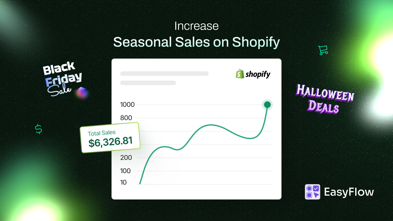
The shift to mobile commerce is already here and it is dominating. Mobile devices now account for the majority of eCommerce traffic worldwide, with smartphones alone driving nearly 60% of all online purchases. This trend is even more highlighted during peak shopping events like Black Friday, Cyber Monday, or Holiday sales, when mobile traffic can surge.
Many store owners miss that mobile shoppers are not just browsing, they are buying. The conversion gap between mobile and desktop has been steadily closing, but only for stores that deliver exceptional mobile experiences. Customers expect the same level of functionality and ease on their phones as they do on desktop computers. When it comes to product customization, every option, every swatch and every input field must be designed with mobile users in mind.
Consumer behavior on mobile devices differs significantly from desktop shopping patterns. Mobile shoppers tend to make quicker decisions. They do not want complicated interfaces. It makes them more likely to abandon their carts when faced with friction.
Mobile users often shop in moments of downtime, such as while commuting, waiting in line, or relaxing on the couch. This means they want a fast, intuitive experience that does not require intense concentration or multiple attempts to get right. The consequences of neglecting mobile optimization extend far beyond a few frustrated customers. Poor mobile user experience directly impacts your bottom line in measurable ways.
When customers encounter difficulties customizing products on their phones, they do not just leave; they form negative impressions of your brand. In an era where customer reviews and social media feedback can make or break a business, one messy mobile experience can translate into lost customers and damaged reputation. Moreover, search engines now prioritize mobile-friendly websites in their rankings, meaning poor mobile optimization can also hurt your visibility and organic traffic.
Common Mobile Customization Pitfalls (And How to Avoid Them)
Understanding what goes wrong with mobile product options is the first step toward creating a better experience. Let us explore the most common issues that create barriers for mobile shoppers and how to address them effectively.
Tiny Touch Points
On average, an adult fingertip is about 10-14mm wide. However, many product option buttons, swatches and checkboxes are designed for mouse cursors that can be pixel-perfect. When customers try to tap a small color swatch or select a radio button on their phone, they often accidentally hit the wrong option or struggle to select anything at all.
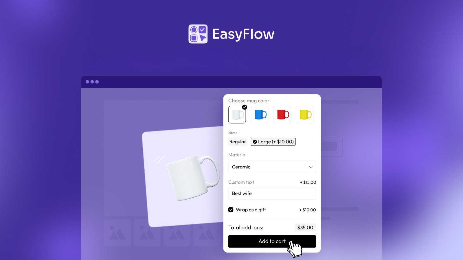
The solution is simple but often overlooked: make all interactive elements at least 44×44 pixels (the recommended minimum touch target size). Color swatches should be large enough to clearly display the color while being easy to tap. Buttons need adequate spacing between them to prevent accidental selections. Radio buttons and checkboxes should have tappable areas that extend beyond the visible element itself, making them more forgiving of imprecise touches.
Endless Scrolling
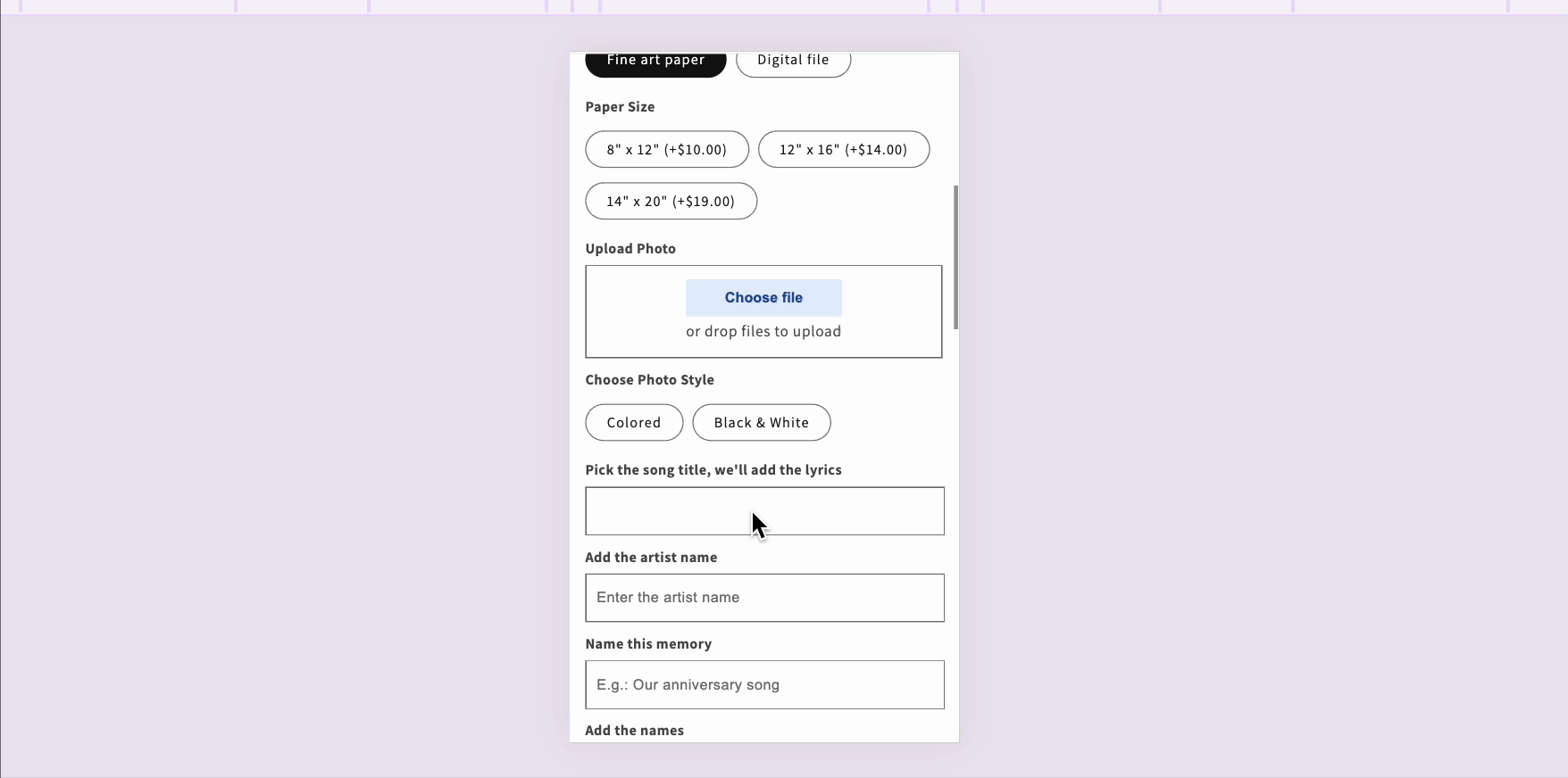
Desktop screens can comfortably display dozens of product options simultaneously. Mobile screens cannot. When you cram all your product variants, add-ons and customization fields onto a mobile screen, customers face an overwhelming wall of choices that requires endless scrolling to navigate.
This is not just inconvenient; it is psychologically exhausting. Decision fatigue sets in quickly, and customers who feel overwhelmed are more likely to abandon their purchase entirely. The solution involves smart organization and progressive disclosure. Group related options together, use conditional logic to show only relevant choices based on previous selections and consider breaking complex customizations into logical steps rather than presenting everything at once.
Slow Loading Times
Mobile users often shop on cellular connections that are not as fast or reliable as home Wi-Fi. When your product options involve high-resolution images for swatches, heavy scripts for dynamic pricing, or poorly optimized code, loading times suffer.
Optimization is crucial. Compress swatch images without sacrificing quality, minimize unnecessary scripts and ensure your option display logic is efficient. Lazy loading techniques can help by loading options only as customers scroll to them, rather than loading everything up front.
Confusing Navigation
Traditional dropdown menus work well on desktops, but they often cause problems on mobile devices. Small dropdown arrows are hard to tap, the menus themselves can be difficult to navigate with fingers and on some devices, they trigger the native mobile picker interface that obscures the rest of the page.
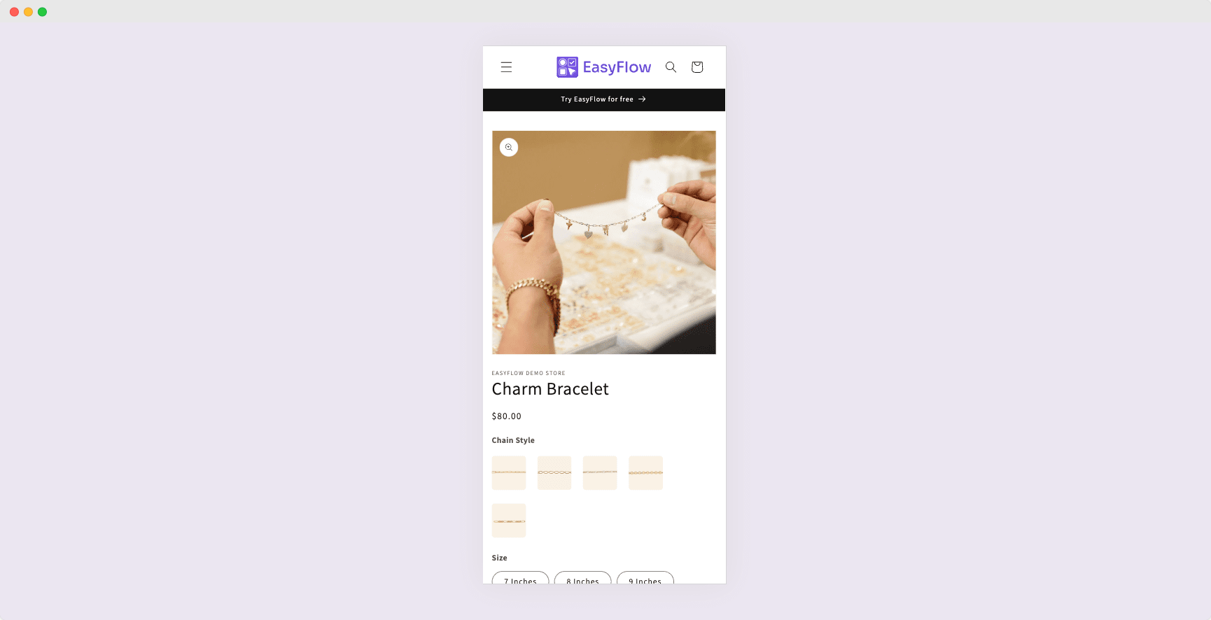
For mobile optimization, visual selection methods work far better than dropdowns. Image swatches for colors, button selections for sizes and radio buttons for simple either-or choices provide clearer, more intuitive interfaces that work naturally with touch input. Reserve dropdowns only for long lists where other methods would be impractical and even then, ensure they are properly styled for mobile interaction.
Invisible Price Updates
One of the most frustrating mobile experiences occurs when customers select options with additional costs but can not see how these selections affect the total price. On a desktop, there is usually plenty of space to display running totals clearly. On mobile, price information often gets pushed below the fold or hidden entirely, leaving customers uncertain about what they are actually paying.
Clear, persistent price display is non-negotiable for mobile product options. The total price should update in real-time as customers make selections and it should remain visible even as they scroll through options. Consider using sticky headers or floating price bars that follow the customer as they scroll, ensuring they always know the current cost.
Essential Features of Mobile-Optimized Product Options
Creating an excellent mobile customization experience requires more than just avoiding pitfalls; it demands intentional design choices that prioritize the mobile user experience from the ground up.
Touch-Friendly Interface Elements
The foundation of mobile optimization is ensuring every interactive element is designed for fingers, not only for mouse cursors. This goes beyond just sizing. Touch-friendly interfaces anticipate how people naturally interact with their phones. Buttons should have adequate spacing to prevent accidental taps. Swatches should be large enough to clearly show what they represent while being easy to select. Input fields should be appropriately sized and labeled to work well with mobile keyboards.
Consider the visual feedback your interface provides. When someone taps an option, they should immediately see that it has been selected through clear visual changes, color shifts, checkmarks, borders, or other indicators. On mobile, where precision is lower, this feedback becomes even more important to confirm that the correct choice was registered.
Responsive Design That Truly Adapts
True responsive design means more than just making elements fit on smaller screens. It involves fundamentally rethinking how information is presented and organized based on the device. A three-column layout of product options might work beautifully on a desktop but become cramped and difficult to navigate on a phone.
Mobile-optimized options should stack vertically in a logical flow, with clear visual hierarchy guiding customers through their choices. White space becomes more valuable on mobile screens, as it helps separate distinct options and makes the interface feel less cluttered. Typography needs to be large enough to read comfortably without zooming and contrast must be sufficient for readability in various lighting conditions, including bright outdoor environments where many people use their phones.
Smart Option Organization
The way you structure and present product options can make or break the mobile experience. Instead of showing all options simultaneously, consider using progressive disclosure, which means revealing options in a logical sequence as customers make choices. For example, after selecting a t-shirt size, you might then show relevant style options or add-ons.
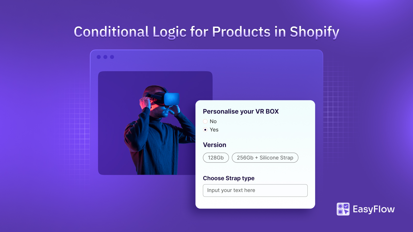
Conditional logic plays a crucial role here. If certain options are only relevant when specific choices are made, use conditional visibility to keep the interface clean and focused. This not only reduces visual clutter but also helps guide customers through a logical decision-making process that feels natural and intuitive.
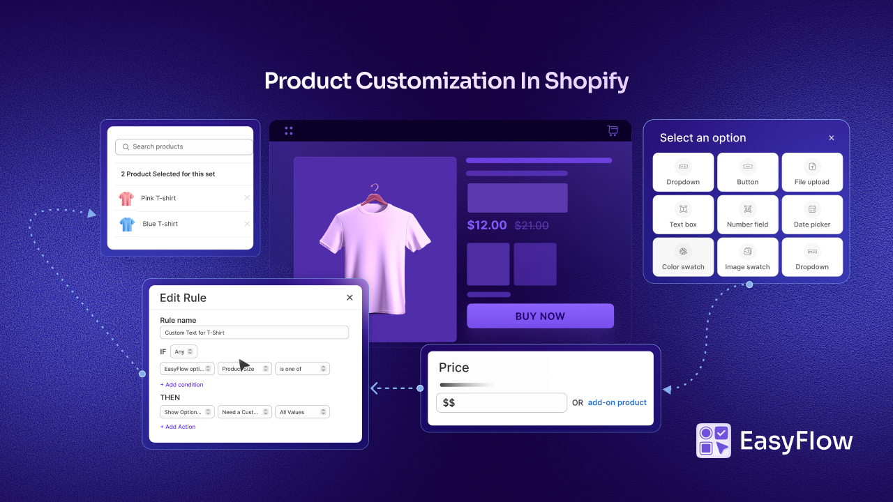
When it comes to implementing mobile-optimized product options on Shopify, having the right tools makes all the difference. EasyFlow Product Options stands out as a solution specifically designed to deliver exceptional experiences across all devices, with particular attention to mobile optimization.
Performance Optimization
Speed is a feature, especially on mobile devices. Every element of your product options should be optimized for quick loading and smooth interaction. This includes:
- Compressing images used for swatches and option displays
- Minimizing JavaScript that needs to execute
- Using efficient code for dynamic price calculations
- Implementing caching where appropriate
- Avoiding unnecessary external resource calls
The goal is to create an experience that feels instant and responsive, even on slower mobile connections. Customers should be able to tap, select, and see updates without noticeable delays or lag.
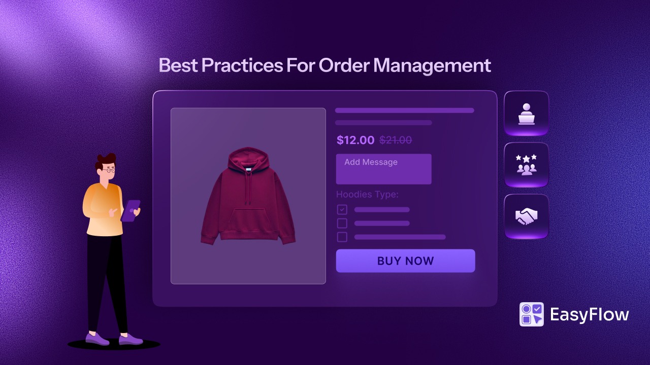
Streamline Mobile Customization with EasyFlow Product Options
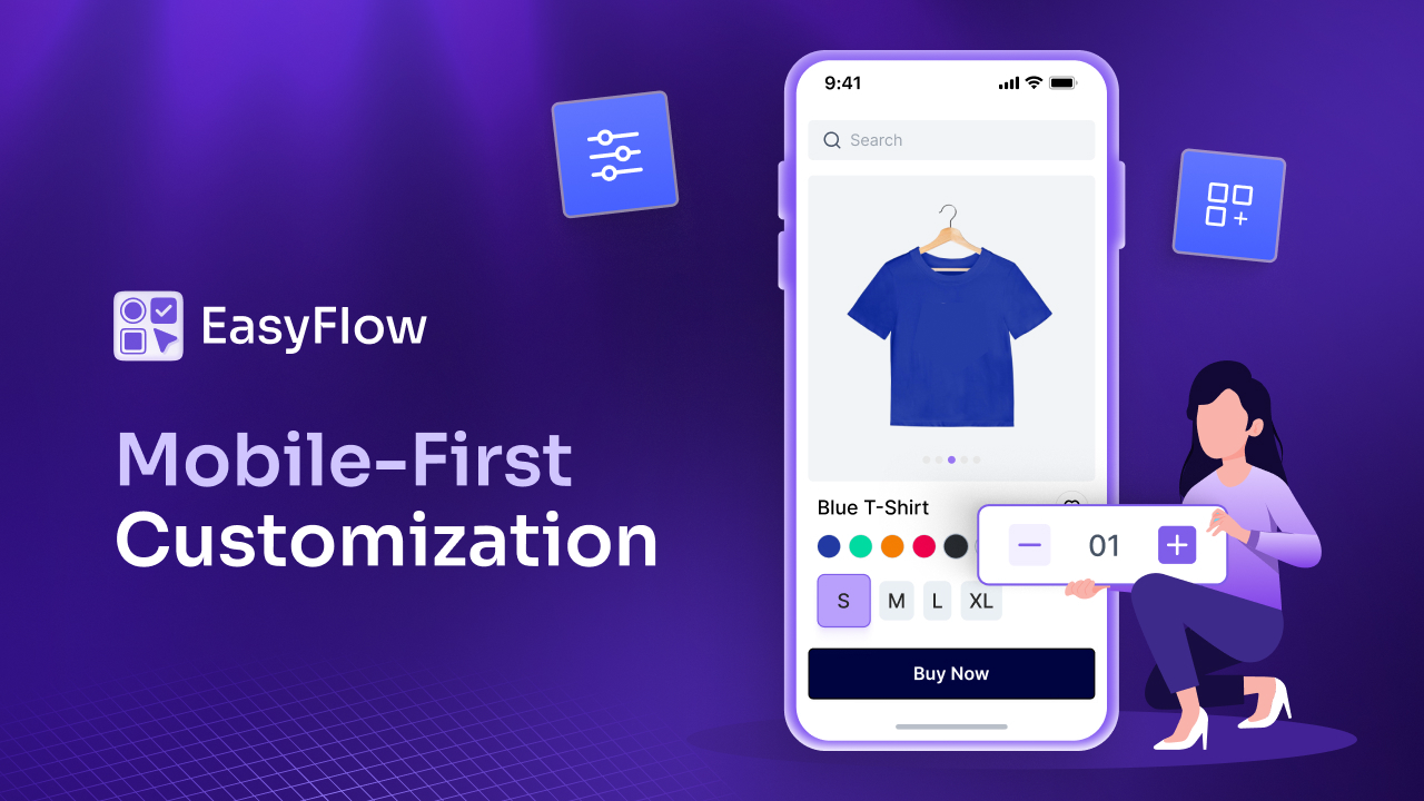
EasyFlow is built on a mobile-first philosophy. This is not about making desktop features work adequately on mobile; it is about creating an experience that feels native and intuitive on touch devices from the ground up. The app’s responsive design automatically adapts to different screen sizes, ensuring that whether a customer is shopping on a small smartphone or a large tablet, the product options display appropriately and function smoothly.
This product options app offers a comprehensive range of option types, each optimized for mobile interaction. Image and color swatches provide visual, intuitive selection methods that work beautifully on touch screens. Customers can tap a color swatch to see their selection immediately, without struggling with dropdown menus or tiny radio buttons.
The conditional logic feature is valuable for maintaining clean mobile interfaces. By showing or hiding options based on previous selections, you ensure customers see only choices relevant to their current configuration.
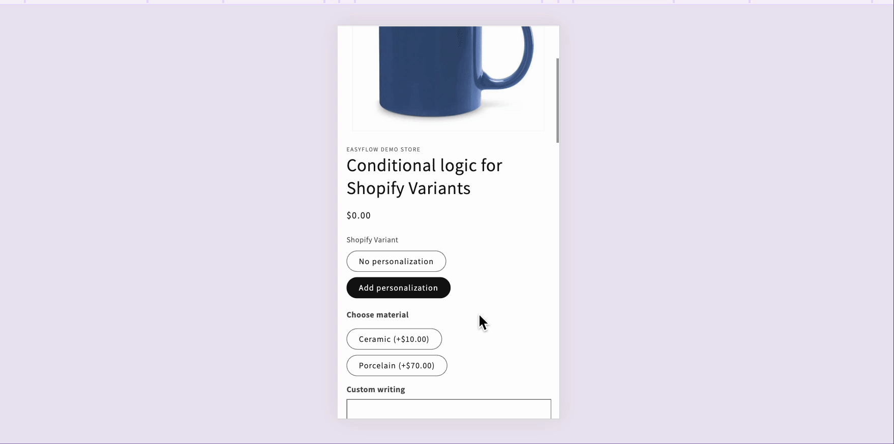
For example, if someone selects a basic version of a product, they will not be confused by premium options that do not apply. This reduces scrolling, minimizes decision fatigue and creates a more streamlined mobile shopping experience.
As you prepare for the holiday shopping rush, EasyFlow’s quick setup process means you can optimize your entire catalog before the critical sales period begins. The app is designed to handle high traffic smoothly, with stable performance even during peak shopping hours. By reducing cart abandonment through intuitive mobile flows, EasyFlow helps you capture more of the mobile traffic.
Ensure Your Product Options Work Seamlessly on Phones
In today’s mobile-dominated eCommerce world, optimizing product customization for phones is not optional; it is essential for growth. Customers browsing your store on their smartphones expect intuitive, fast, and friction-free experiences. When you deliver on these expectations, you not only capture more sales but build loyalty that extends far beyond individual transactions.
By taking action now to ensure your product options work seamlessly on phones, you position your store to capture its fair share of the holiday shopping bonanza.
The question is not whether to optimize for mobile; it is whether you will do it before your competitors do. In mobile commerce, smooth customization equals more sales. Start optimizing today, and watch your mobile conversion rates climb as you deliver the seamless experiences that modern shoppers demand.
If you found this blog helpful, please subscribe for more expert guides, tutorials and tips on unlocking the full potential of your Shopify store.


